Interactive Chart Generator – User Documentation#
Purpose#
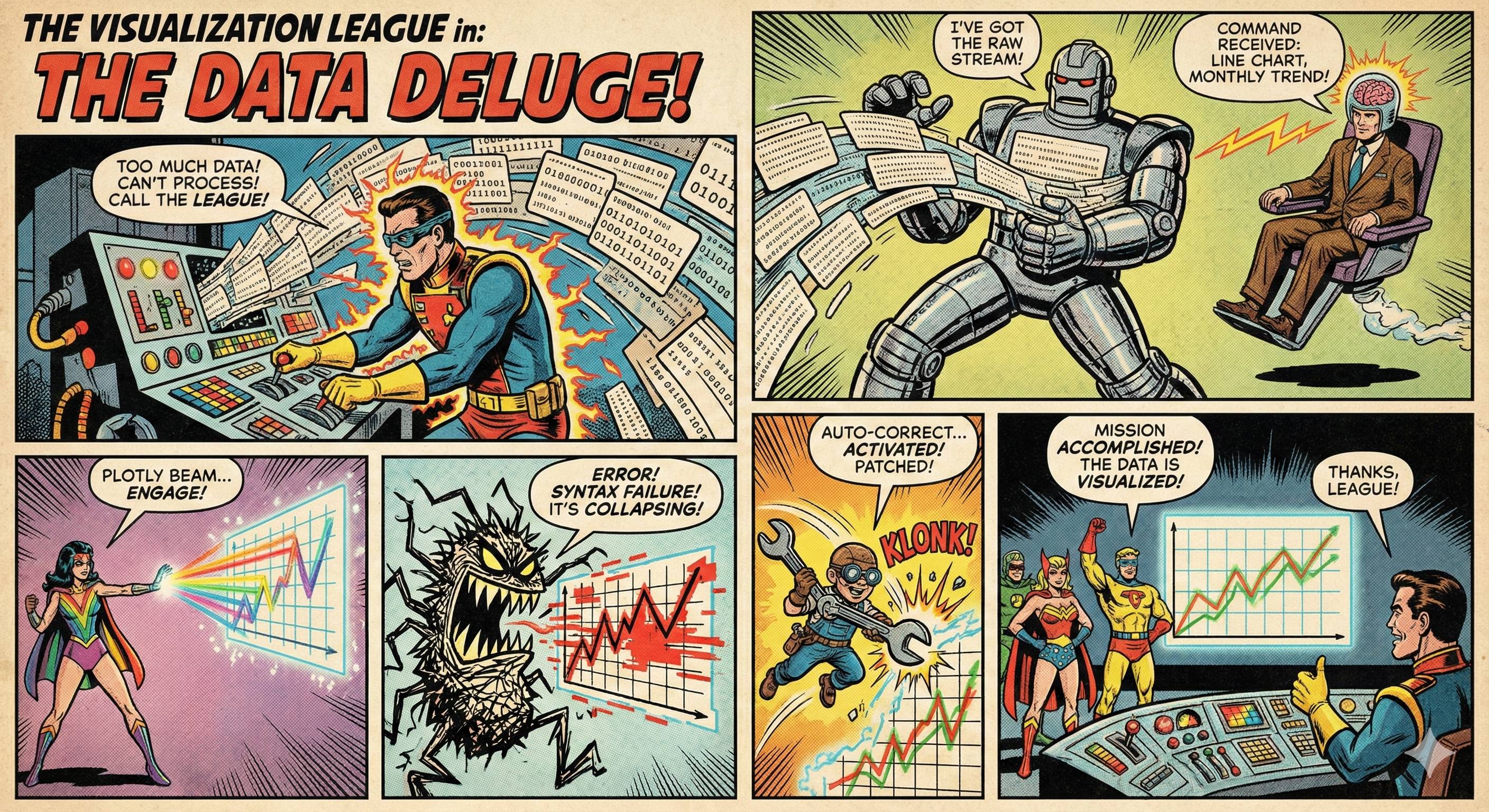
The tool is an interactive system for creating data visualisations from CSV or Excel files. It allows you to make requests formulated in natural language to automatically generate charts. The basic principle is based on a combination of machine learning and a clear architecture that structures the workflow from intent recognition to planning and execution. This allows you to perform complex data analyses without programming knowledge and quickly gain deeper insights into your data.
Range of functions#
- File format support: Loads CSV and Excel files (including multiple tables) with automatic type recognition.
- Natural language input: Create and customise charts with simple text inputs such as ‘Show top 10 as bar chart’.
- Intelligent intent recognition: The integrated LLM understands your request and generates a suitable execution plan.
- Interactive visualisations: Charts are created with Plotly and support zoom, pan, hover and other interactive features.
- Automatic error correction: If there are errors in the code, the LLM attempts to correct them, with up to three retries.
- Theme change: Switch between light and dark colour schemes with a single click.
- Export options: Save charts as HTML or PNG files.
- Chart history: Access the last ten charts created.
- Fallback mechanism: Seaborn is automatically used as a fallback in case of Plotly errors.
Operation#
Step-by-step instructions#
Starting the application Either run
docker-compose up -d(recommended) or install the dependencies manually and start withpython main.py. The application can then be accessed athttp://localhost:7860(manually) orhttp://localhost:7860/chart(Docker).Upload file
Click on ‘Upload file’ and select a CSV or Excel file. For Excel files, you can choose from multiple tables.Processing the file
After uploading, the file is analysed. The application displays a summary of the file information, including the number of rows, columns and tables.Create chart
Enter your request in the chat window, e.g. ‘Create a line chart for the monthly trend’. The application processes the request and generates the chart.Customise chart You can customise the chart by entering additional information, e.g. ‘Colour the bars red’ or ‘Change the title to “Revenue 2024”’.
Export chart
Click on ‘HTML’ or ‘PNG’ to save the current chart.Load chart from history
Click on a chart in the gallery of the last ten charts to display it again.
Important controls#
- Chat window: Enter queries in natural language.
- File upload: Upload CSV or Excel files.
- Sheet selection: Select tables in Excel files.
- Theme button: Switch between light and dark colour schemes.
- Export buttons: Save the diagram as HTML or PNG.
- Chart gallery: Overview of the last ten charts created.
Special notes#
- File size: Maximum 50 MB per file.
- Row and column limit: Maximum 30,000 rows and 200 columns per table.
- Column names: Must not be too long (max. 100 characters); will be shortened automatically.
- File formats: Supports
.csv,.xlsx,.xls. - Export: The
kaleidopackage is required for PNG export.
Application example#
Initial situation: A research project at a university collects monthly survey results on student satisfaction. The data is available in an Excel file with several tables, one of which contains the monthly evaluations.
Objective: Visualise the development of satisfaction over time in a line chart.
Implementation:
- Upload the Excel file.
- Select the relevant table in the sheet selection field.
- Enter the query: ‘Create a line chart for the monthly trend in satisfaction’.
- The application generates an interactive chart showing the development over the months.
- Customise: ‘Change the title to “Student satisfaction over time”’.
- Export as HTML for presentation.
Result: A clearly structured, interactive chart that illustrates the development of satisfaction over time and can be integrated directly into scientific reports.
Recommendations for efficient use#
- Use precise and clear natural language, e.g. ‘Show the top 5 categories as a bar chart’ instead of ‘Make a chart’.
- Use the chart history to quickly find previous visualisations.
- Enable the dark theme when working for long periods to reduce eye strain.
- Use the HTML export if you want to integrate interactive charts into web pages or reports.
- For large files: Reduce the number of rows or columns before uploading the file.
- Ensure that column names are unique and not too long to avoid processing issues.
System limitations#
- The tool cannot load data directly from databases or web APIs.
- It does not support complex data structures such as hierarchical or multidimensional data.
- The number of concurrent users is not explicitly limited, but local system resources (memory, CPU) affect performance.
- For very complex queries, the LLM may not be able to generate the desired visualisation.
- Automatic type recognition may fail for unstructured data.
- The number of simultaneous charts is limited by memory capacity and session management configuration.
Summary#
The Interactive Chart Generator is a powerful tool for quickly and intuitively creating data visualisations from tabular data. It allows you to generate complex charts using simple voice commands, without any programming knowledge. The architecture with service layer and automatic error correction ensures stability and user-friendliness. As a user, you take on the role of a data analyst who gains deeper insights into their data through clear formulations and targeted adjustments. The tool is particularly suitable for scientific work, presentations and quick data analysis in higher education.